Add new InputGroup compound component with Addon, Suffix, and Button support#249
Open
pedromenezes1 wants to merge 15 commits intocloudflare:mainfrom
Open
Add new InputGroup compound component with Addon, Suffix, and Button support#249pedromenezes1 wants to merge 15 commits intocloudflare:mainfrom
pedromenezes1 wants to merge 15 commits intocloudflare:mainfrom
Conversation
 pedromenezes1
force-pushed
the
feat/input-group-addon
branch
from
pedromenezes1
force-pushed
the
feat/input-group-addon
branch
from
b348d28 to
86e9d5d
Compare
pedromenezes1
changed the title
pedromenezes1
changed the title
pedromenezes1
changed the title
pedromenezes1
force-pushed
the
feat/input-group-addon
branch
17 times, most recently
from
1f88e51 to
ca11f35
Compare
commit: |
pedromenezes1
force-pushed
the
feat/input-group-addon
branch
from
ca11f35 to
5c4d6f2
Compare
Contributor
Docs PreviewCommit: |
Contributor
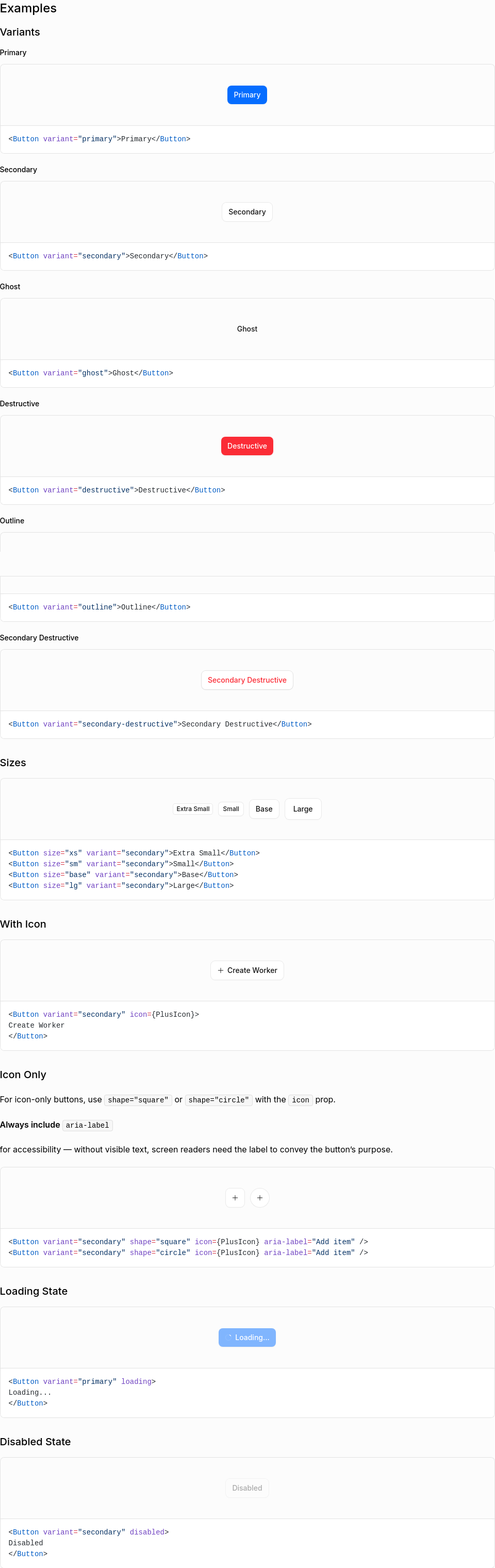
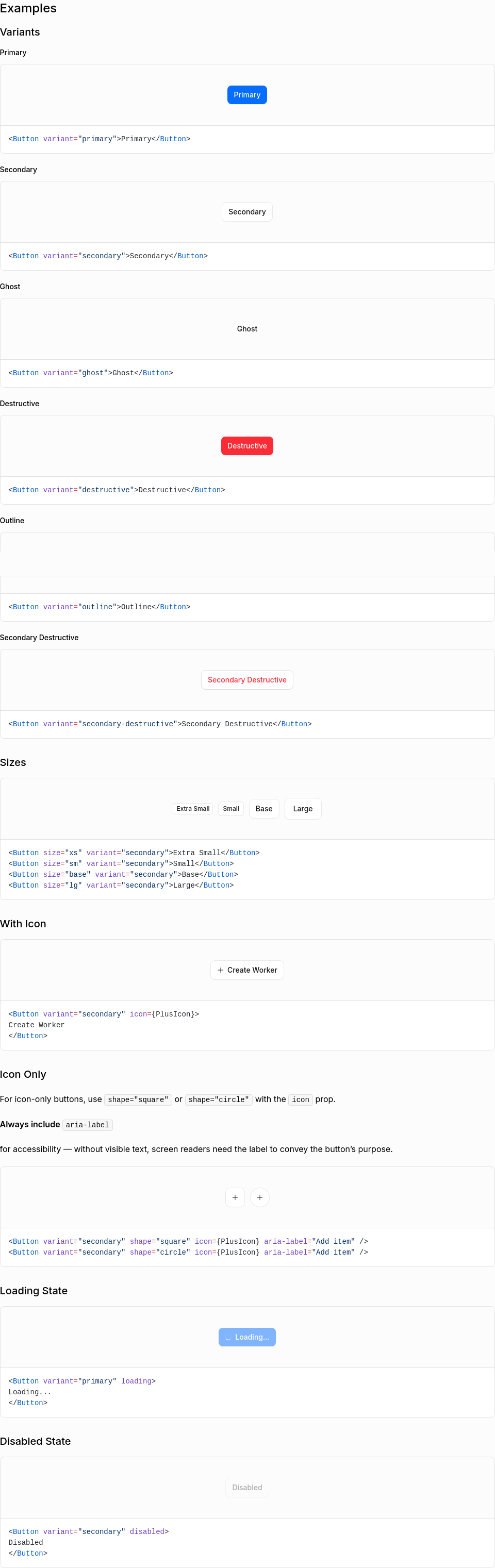
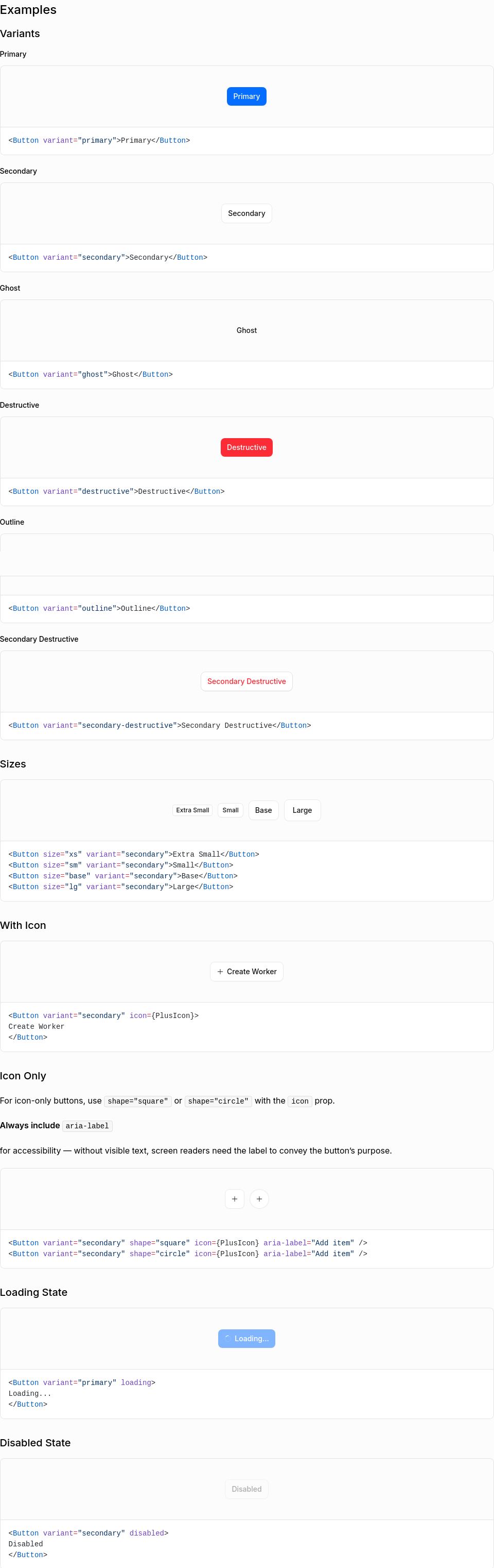
Visual Regression Report21 screenshot(s) with visual changes: Button / Variants3 px (0%) changed
Button / Sizes6 px (0%) changed
Button / With Icon51,698 px (1.77%) changed
Button / Icon Only5 px (0%) changed
Button / Loading State4 px (0%) changed
Button / Disabled State4 px (0%) changed
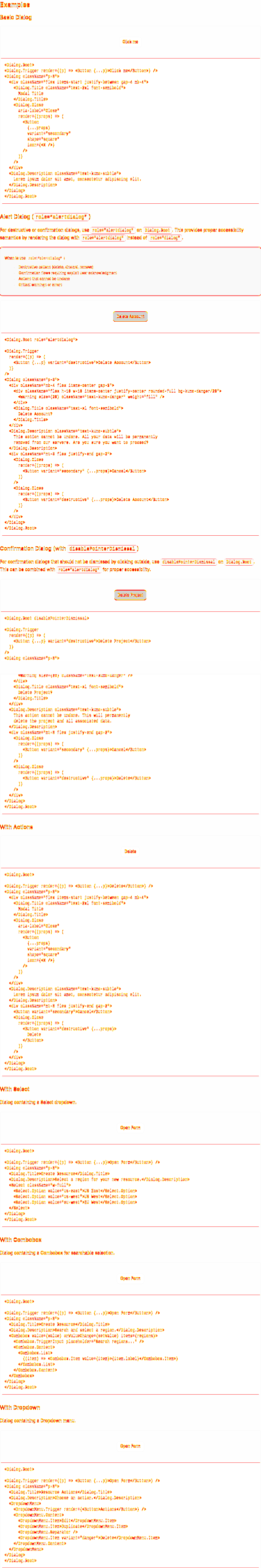
Dialog / Basic Dialog95,109 px (1.72%) changed
Dialog / Alert Dialog (role=“alertdialog”)128,217 px (2.32%) changed
Dialog / Confirmation Dialog (with disablePointerDismissal)20,161 px (0.36%) changed
Dialog / With Actions137,099 px (2.48%) changed
Dialog / With Select125,980 px (2.28%) changed
Dialog / With Combobox159,863 px (2.89%) changed
Dialog / With Dropdown149,829 px (2.71%) changed
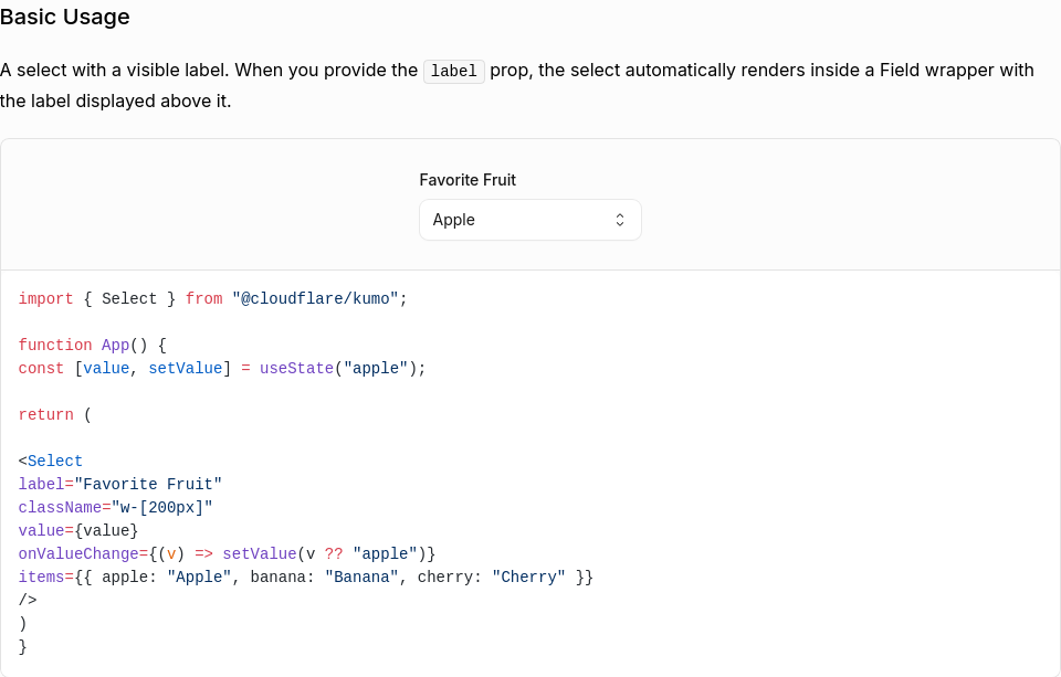
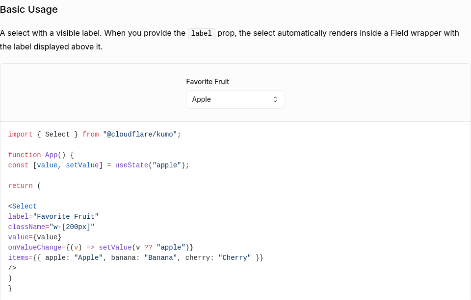
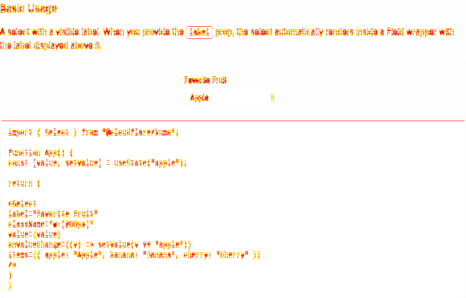
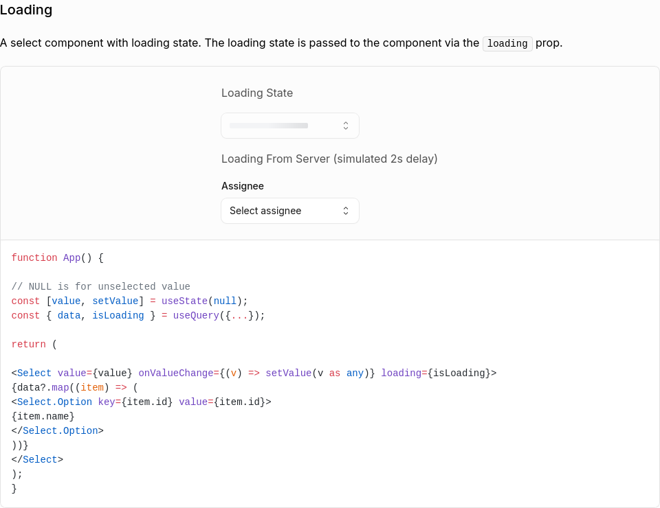
Select / Basic Usage11,446 px (1.95%) changed
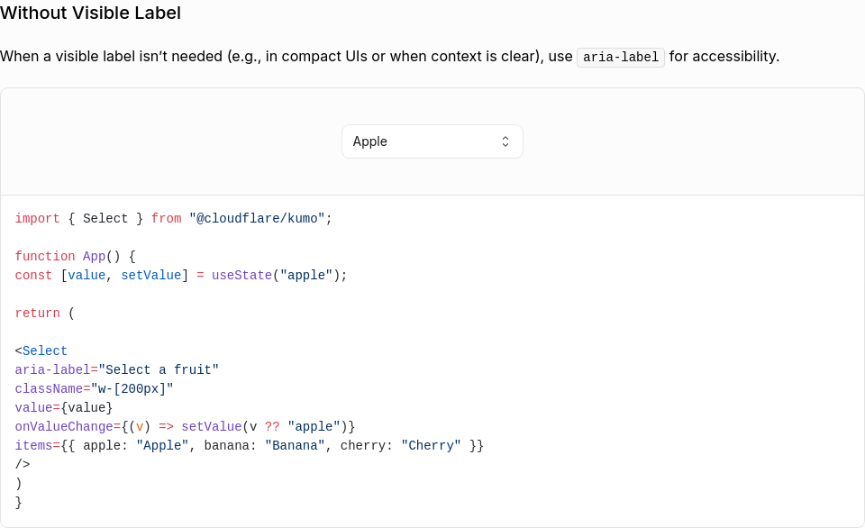
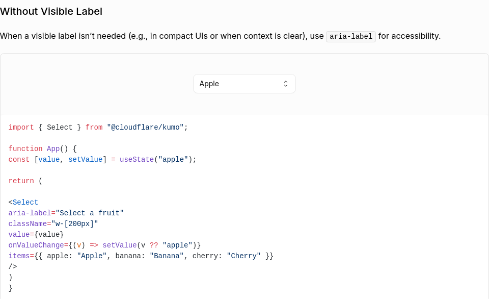
Select / Without Visible Label13,032 px (2.32%) changed
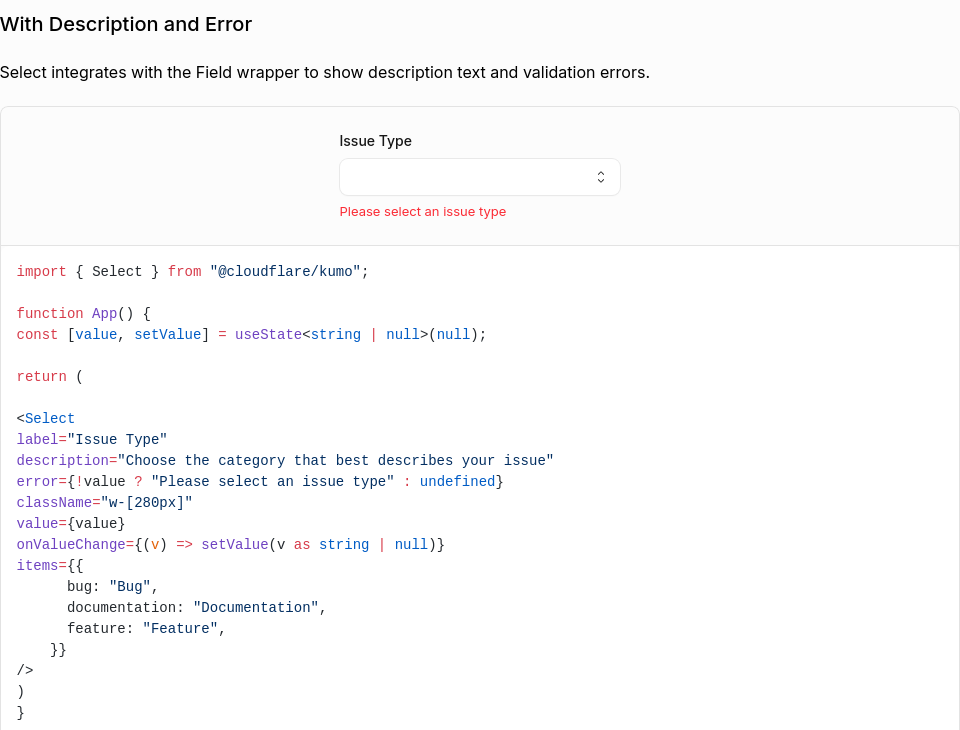
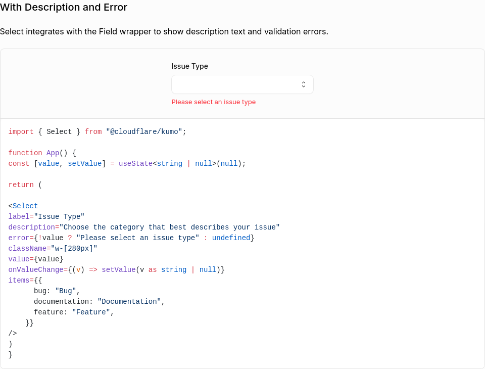
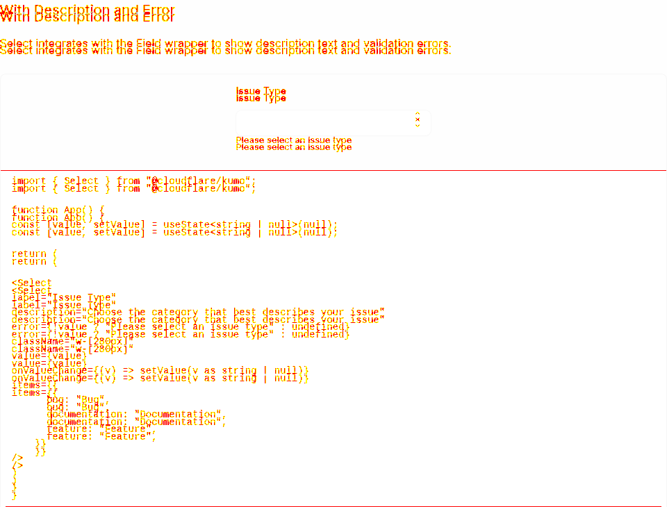
Select / With Description and Error17,198 px (2.45%) changed
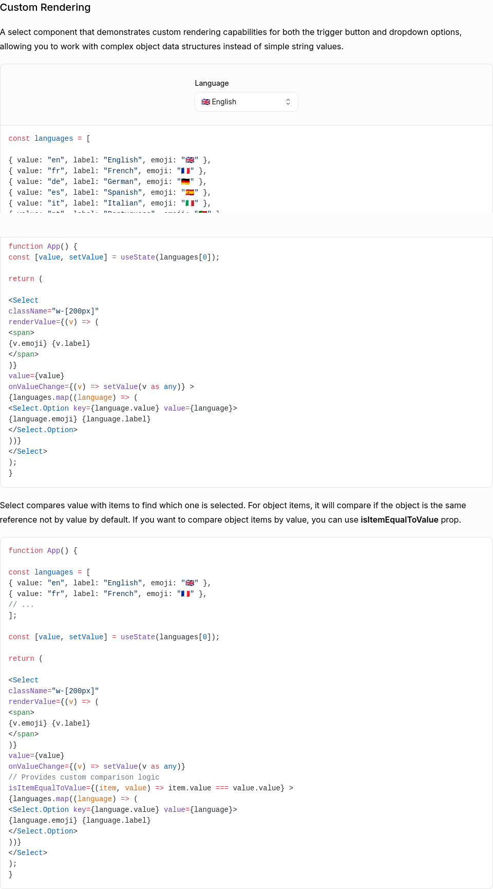
Select / Custom Rendering45,217 px (2.72%) changed
Select / Loading9,888 px (1.39%) changed
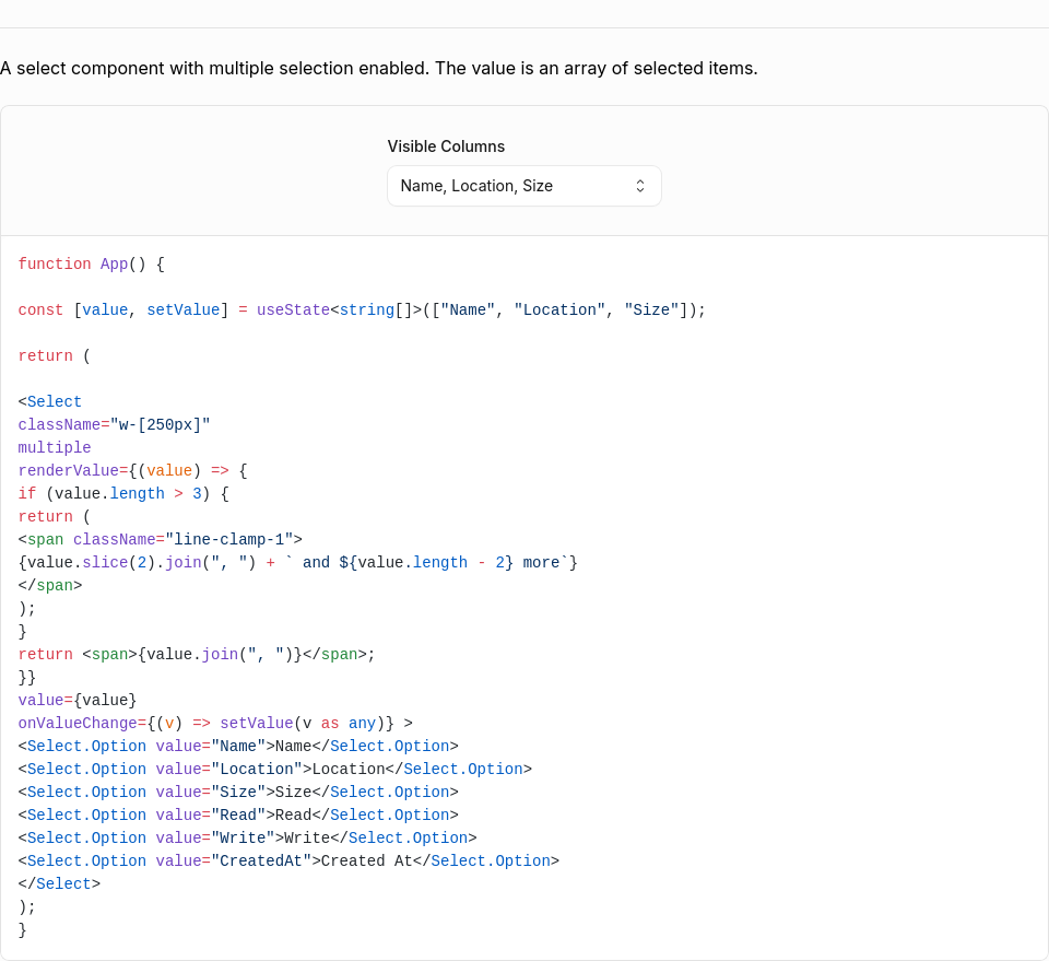
Select / Multiple Item19,794 px (2.35%) changed
Select / Select21,057 px (2.45%) changed
Select (Open)0 px (0%) changed
5 screenshot(s) unchanged
Generated by Kumo Visual Regression |


 mattrothenberg
force-pushed
the
feat/input-group-addon
branch
from
mattrothenberg
force-pushed
the
feat/input-group-addon
branch
from
0caf233 to
5bbecc8
Compare
pedromenezes1
force-pushed
the
feat/input-group-addon
branch
from
92de07e to
aa1cfae
Compare
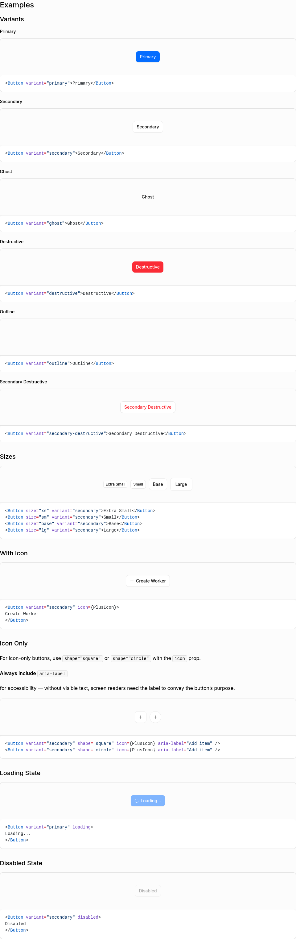
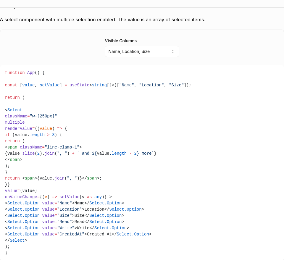
…on support

New InputGroup compound component for building inputs with icons, addons, inline suffixes, and action buttons.

Features:
- Field Integration — Accepts label, description, error, required, and labelTooltip props
- Addons — Place icons or text before/after the input using align="start" or align="end"
- Compact Button — Small button inside an Addon for secondary actions
- Action Button — Full-height flush button as a direct child for primary actions
- Inline Suffix — Text that flows seamlessly next to the typed value
- Size Variants — xs, sm, base, lg sizes cascade to all children via context
- Error State — Error flows through context; InputGroup.Input auto-sets aria-invalid
- Disabled State — disabled prop disables all interactive children

Sub-components:
- InputGroup — Root container; provides context and accepts Field props
- InputGroup.Input — Styled input; inherits size, disabled, error from context
- InputGroup.Addon — Container for icons, text, or compact buttons
- InputGroup.Button — Full-height button (direct child) or compact button (inside Addon)
- InputGroup.Suffix — Inline text suffix with automatic width measurement

Includes comprehensive documentation page with demos and unit tests.
…on support

New InputGroup compound component for building inputs with icons, addons, inline suffixes, and action buttons.

Features:
- Field Integration — Accepts label, description, error, required, and labelTooltip props
- Addons — Place icons or text before/after the input using align="start" or align="end"
- Compact Button — Small button inside an Addon for secondary actions
- Action Button — Full-height flush button as a direct child for primary actions
- Inline Suffix — Text that flows seamlessly next to the typed value (uses CSS field-sizing)
- Size Variants — xs, sm, base, lg sizes cascade to all children via context
- Error State — Error flows through context; InputGroup.Input auto-sets aria-invalid
- Disabled State — disabled prop disables all interactive children

Sub-components:
- InputGroup — Root container; provides context and accepts Field props
- InputGroup.Input — Styled input; inherits size, disabled, error from context
- InputGroup.Addon — Container for icons, text, or compact buttons
- InputGroup.Button — Full-height button (direct child) or compact button (inside Addon)
- InputGroup.Suffix — Inline text suffix with CSS-based automatic width sizing

Includes comprehensive documentation page with demos and unit tests.
- Suppress outline on inner input with outline-none!
- Add has-[:focus-visible]:outline-auto to container in grouped mode
- When inner input receives keyboard focus, the native focus ring appears on the entire InputGroup container
- Uses browser's native -webkit-focus-ring-color for consistent appearance
- Fix addon padding with explicit pl-*/pr-* classes (Tailwind JIT compatible)
- Add type="button" to flush Button to prevent form submission
- Add forwardRef to InputGroup.Input for ref forwarding
- Add tests for error state (aria-invalid) and Field integration
- Update component registry with ring-kumo-line color token
- Revert flush button to render inside container (fixes focus ring issues)
- Make addon padding symmetric (start and end now match)
- Add forwardRef to InputGroup.Button for consistency
- Pass disabled state from context to Button
- Add tests for button variant and disabled state
- Fix stale JSDoc comment
- Use ring-0 instead of ring ring-transparent for clarity
pedromenezes1
force-pushed
the
feat/input-group-addon
branch
from
141af9b to
bf48d95
Compare
- Add data-slot="input-group" for CSS targeting
- Remove overflow-visible rule for buttons (breaks clipping)
- Remove inline ring-transparent (was hiding focus ring)
- Add outline-none to inner input (prevent double outline)
- Let kumo-binding.css handle native outline
Match the docs format change from main (commit adfc9ab)
Resolve conflicts:
- SidebarNav.tsx: Add both InputArea and InputGroup entries
- HomeGrid.tsx: Add both input-area and input-group routes
- kumo-binding.css: Keep InputGroup focus ring CSS
- component-registry: Regenerate to include all components
Brings in Radio Card docs fix, Radio Object.assign fix, and version bumps.
This file contains hidden or bidirectional Unicode text that may be interpreted or compiled differently than what appears below. To review, open the file in an editor that reveals hidden Unicode characters.
Learn more about bidirectional Unicode characters
Sign up for free
to join this conversation on GitHub.
Already have an account?
Sign in to comment
2 participants
Add this suggestion to a batch that can be applied as a single commit.This suggestion is invalid because no changes were made to the code.Suggestions cannot be applied while the pull request is closed.Suggestions cannot be applied while viewing a subset of changes.Only one suggestion per line can be applied in a batch.Add this suggestion to a batch that can be applied as a single commit.Applying suggestions on deleted lines is not supported.You must change the existing code in this line in order to create a valid suggestion.Outdated suggestions cannot be applied.This suggestion has been applied or marked resolved.Suggestions cannot be applied from pending reviews.Suggestions cannot be applied on multi-line comments.Suggestions cannot be applied while the pull request is queued to merge.Suggestion cannot be applied right now. Please check back later.
New
InputGroupcompound component for building inputs with icons, addons, inline suffixes, and action buttons.Includes comprehensive documentation page with demos and unit tests.
Features
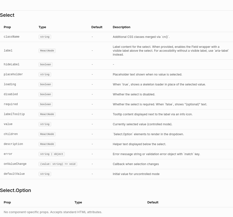
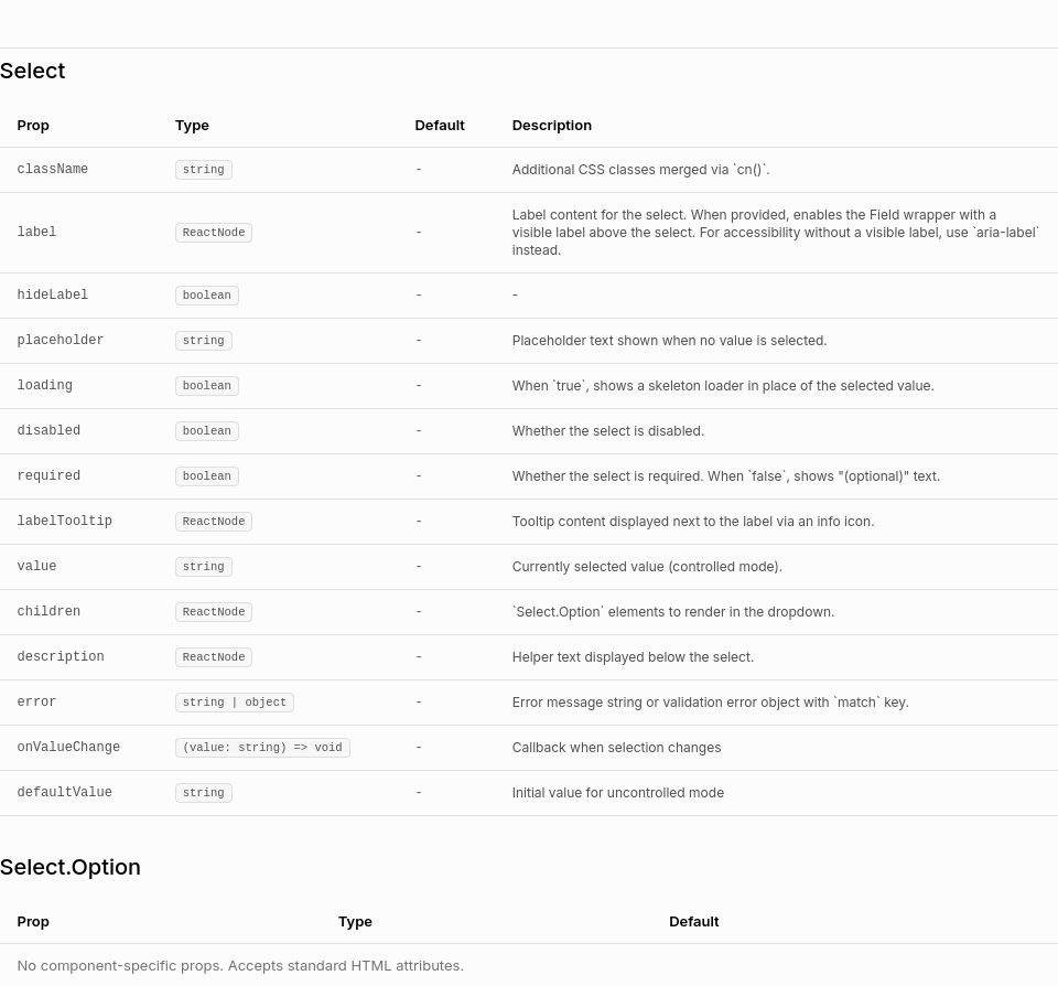
label,description,error,required, andlabelTooltipprops directly; automatically wraps in Field when label is providedalign="start"oralign="end".workers.dev); input width adjusts automatically as user typesxs,sm,base,lgsizes cascade to all children via contextInputGroup.Inputauto-setsaria-invalid="true"when error is presentdisabledprop disables all interactive childrenSub-components
InputGroupInputGroup.Inputsize,disabled,errorfrom contextInputGroup.Addonalign="start"(default) oralign="end"InputGroup.ButtonInputGroup.SuffixUsage Examples
Caveats
InputGroup.Inputomitslabel,description,error,size, andlabelTooltipprops — these are handled by the parentInputGroupInputGroup.Suffix, the input width is measured dynamically via a hidden ghost elementInputGroup.Buttonrenders differently based on placement: full-height flush when direct child, compact when insideAddonScreenshots